|
|
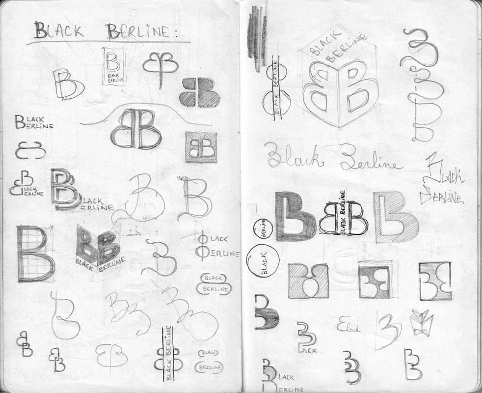
Creating a logo is probably one of the most enjoyable jobs one might ask for, at least it is one of my favorites. The design is always based on the capital letters of the firm's name, and must represent the identity which the brand stands for.
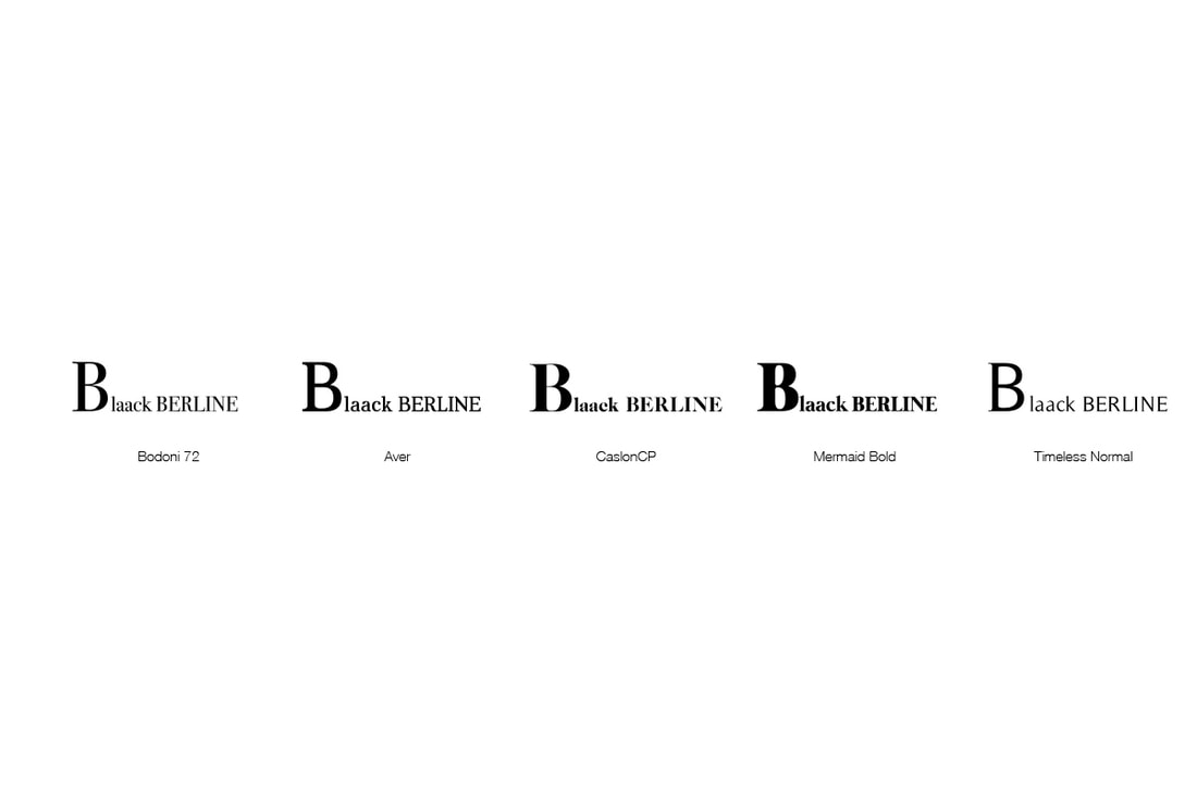
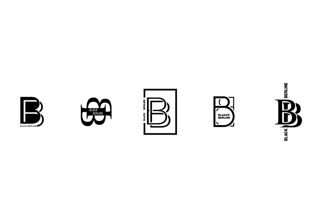
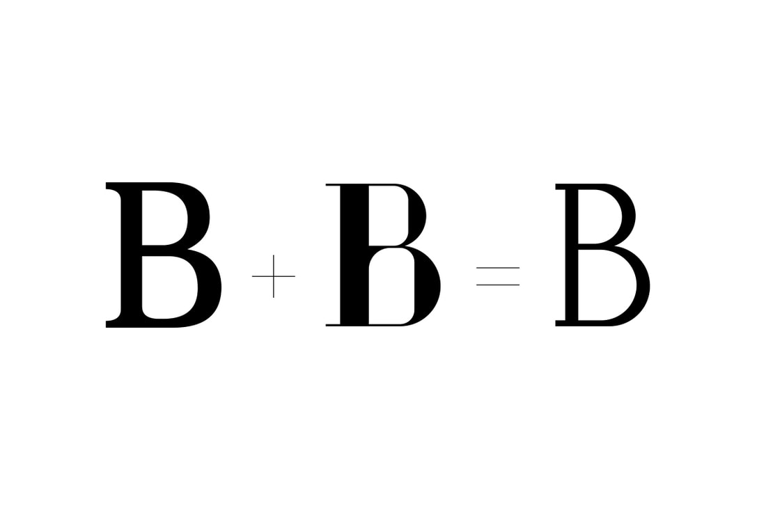
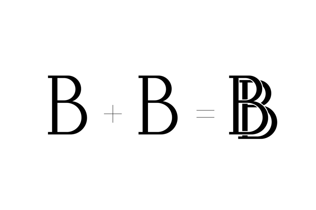
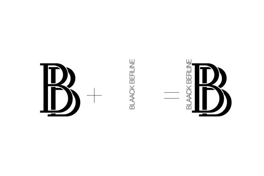
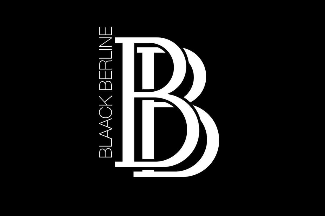
As simple as it sounds, it gets tricky when the letters cannot be arranged in any esthetic manner. Usually, I try to keep it monochrome, considering that it has to be intelligible from a distance. It must catch the eye with simple lines and the essential information. With the two B's in the beginning of Blaack Berline, this logo has been fairly easy to produce. The client wanted a classy logo since he is driving people for important occasions such as a wedding. Therefore between some draft I had done, I advised him to pick the simplest one, mimicking the famous Rolls Royce logo. To this end I merged the thick/classical Aver with the modern Voor to create an uncluttered Serif B capital. The only modern touch I added to those staggered B's is the name of the firm placed vertically. With its simple typography it remains readable. BLAACK BERLINE
Logo design / 2016 15 rue Georges Maeder, 38170 Seyssinet, France Credits: Nicolas Pabion |
|